Fibro-Ed
“If you are lucky enough to find Katie available to work with you don’t hesitate.
Highly skilled, professional in every way and extremely supportive of what you are trying to do.
I would certainly recommend Katie, although I’m a bit concerned she’ll be too busy when I need her again!”
Rachel contacted me as she was nearly finished putting her site together as she needed someone to help her with the final few tweaks and was eager to get the site live. I carried out the following tasks:
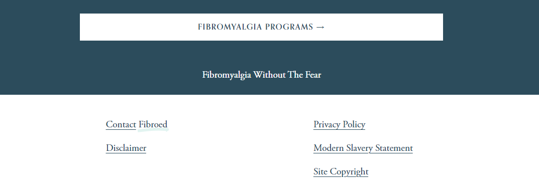
Add buttons to the bottom of each page to direct users and keep the journey through the site flowing.
Add links to footer content, make sure the text is all uniform and remove ‘made by Squarespace’
3. With the blog posts I ensured all links were working correctly when they were copied across, ensuring links to external pages open in a different tab (following best SEO practices) and tweaked the main blog page to a 3 post per row layout.
4. Added a link to the email address on the contact page, now when clicked on the user is taken to a new email page straight away thus removing the need to copy/paste the email address, locate their email and open a new email tab (we like to make things as easy as possible for the user!)
5. On mobile these coloured boxes just weren’t working - they were sat above the text! So I ensured they all appeared correctly, in the right order across all devices.
6. Added a favicon/browser icon to give the site a more professional feel
7. Shortened the blog URL to something more memorable
8. Ensured the digital product which is a free download, was uploaded in the most effective way for the users - this meant removing any unnecessary steps they were forced to take to download the item.
9. I also provided a list of tweaks I would make to the site and carried these out after the main bulk of work was completed.


