BreathGal
I was contacted by the team at BreathGal as they needed help with some key elements on their Squarespace 7.0 site. The developments I made on this round of edits were:
Ensure all the fonts throughout the site compliment each other. There was an array of different fonts and sizes before with no uniformity so I went through and made sure all fonts from headings right through to buttons were clearly aligned.
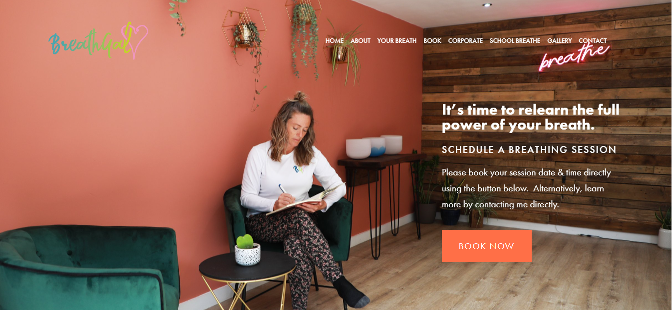
Further develop the home page header - this was very large before with no clear call to action so I rearranged some of the content and made sure it was easy to achieve the main task of the site (booking a session).
Reduce gaps and work on the alignment - there were large gaps between a lot of the content so I went through the site and made sure any spaces made sense and weren’t too large. Whilst doing this I ensured the content was aligned correctly and didn’t feel off.
Upon completion, I went through and added all the fonts used into a new brand guide so that if anyone else works on the brand (from website through to print) they will know quickly how to keep the consistency throughout. I also provided the team with a list of suggestions to make the site even better. I really enjoyed working with BreathGal and look forward to working more with them in the future.
Update
I was contacted again by the team at BreathGal just a couple of months after working with them first time. I love returning customers so made sure to fit them in as quickly as I could! This time I:
- tweaked the headers to keep consistency throughout the site
- Put the FAQs into a drop down accordion instead of 1 long scroll
- Removed any duplicated/unnecessary buttons
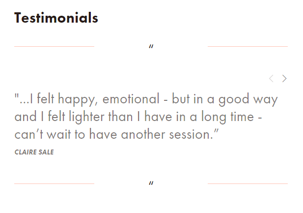
- added a carousel of testimonials so that users could scroll through and see the positive reviews if they needed that reassurance but weren’t bomarded with loads of them on a long scroll down the page.
As always, I enjoyed working with Anwen and Mel over at BreathGal and look forward to working with them again should they need my help!
Carousel of testimonials on the home page
Accordion/drop down of FAQs


